by Jean Marie Carey | 20 May 2013 | Art History, German Expressionism / Modernism, LÖL, Re-Enactments© and MashUps
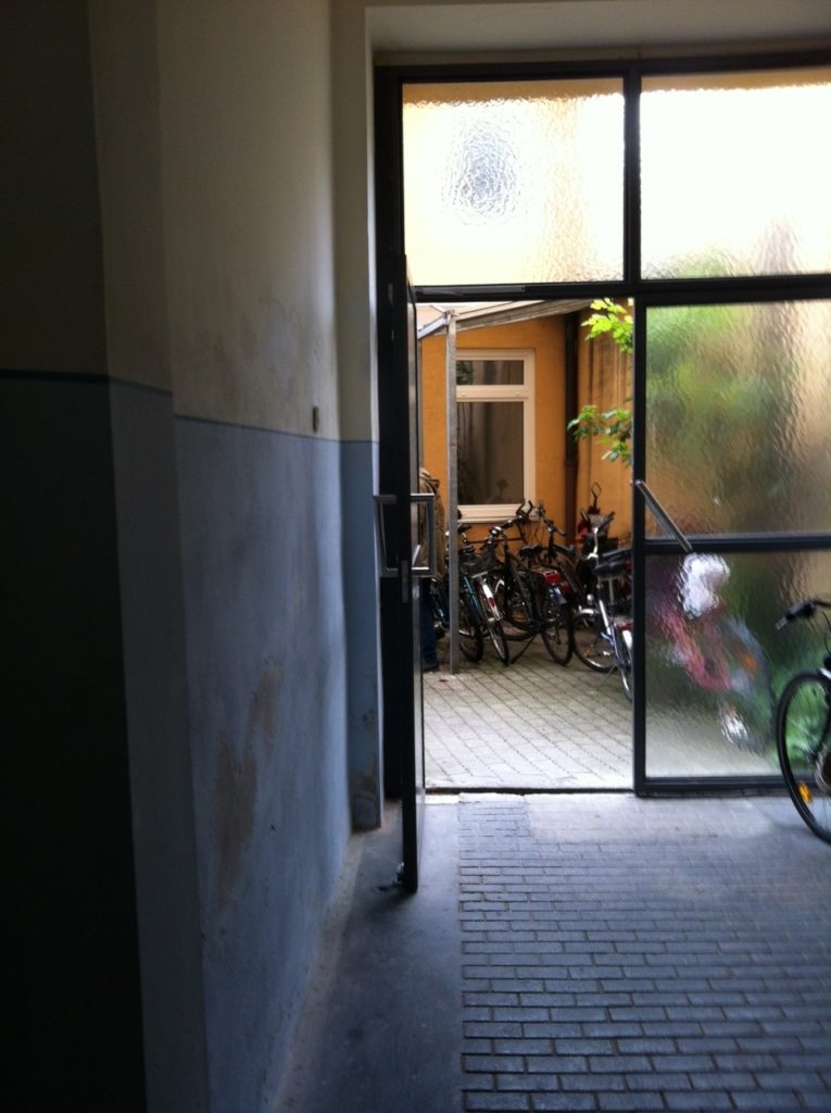
Should We Go In?
I have followed Kunstraum München for some time and now that I’m here have been eager to investigate, a plan somewhat impeded by the Verein’s tendency to announce events through the city (which supports the venue/group for contemporary art and criticism – its 40th anniversary is this year) i.e. a bit slowly, and sporadically through a social media platform owned by someone with the initials MZ I do not often participate in (more on social media at the end), and also since I am often busy on the Wednesdays when meetings and lectures take place.
In any case being free on Pfingstenmontag allowed a friend visiting from Brussels and I to haunt tonight’s talk „Warum im Kollektiv?“ by members of Hamburg’s 8. Salon. Visually this also served as a near-to-closing reception for the Mahlergruppe Austellung Of Two Minds (the actual end date is 26 May). You can see some Mahlergruppe work on its low-key Website. The emphasis on group (founded in 2008 at Munich’s Akademie der Bildenden Künste) and the lack of artists’ statements and biographies is very refreshing, and the powerful graphite-and-acrylic bilder – somewhere between drawings and paintings, are, to me distinctively Munchneresque.
Of Two Minds also includes a sculpture, Bellestar, a craft of formed and draped corrugated framing, and a few photographs of Zurich’s “Needle Park,” circa the 1980s and 1990s at the beginning and then height of needle-borne infection. Of Two Minds isn’t a conceptually straightforward rumination on dystopia, though. Perhaps as the name implies it asks about how we remember these types of weirdly hermetic thought/images that may or may not be indexical. (Of course for Americans the first thing that comes to mind is Al Pacino’s laconic junkie in Panic in Needle Park, the film school staple from 1971.) Thinking about how much Zurich has changed in the past decades doesn’t diminish these images which aren’t exactly memories, though they do form the strong impression of something personally experienced (another film analogy would be the impression of Marseille and Brest from The French Connection and Querelle, though the French coastal cities haven’t been like that in … forever, and were already “not like that” when Genet was writing and Fassbinder and Friedkin were filming).
(more…)

by Jean Marie Carey | 26 Mar 2008 | Art History
Scene from Cory Arcangel installation Super Mario Clouds, 2002
Representation of three-dimensional forms through the single-point, single-plane perspective of the cathode-ray tube projection used for most views and projections of Internet urls has long been problematic for designers of Web pages intended to convey concepts of collected information. Understanding three-dimensional objects with only one viewpoint can be deceptive. In the context of viewing information displayed on Web pages, either for casual browsing or deep contemplation, users understand the limitations of what is seen and unconsciously process the limitations in experiencing volume, texture, space, gravity, mass, and weight, inherent in computer screen displays.
The technology created in 2001 by Pennsylvania-base CubicEye.net thus seems at first a movement toward unconventional and forward-thinking information display yet proves ultimately to be severely limited in scope, execution, and fundamental concept.
According to a story from an August 13, 2001, business news wire routing service for press releases, “The CubicEye metaphor of content management and delivery is based on effectively harnessing the mind’s ability to quickly and easily utilize spatial context.” What this means, basically, is that CubicEye displays linked, related Web pages in a perspectival format that appears to create depth as it theoretically reveals the content of numerous pages upon a single computer screen.
In fact CubicEye presents a visual organization system that is biologically, as well as logically, counterintuitive; this is likely the reason this “new” technology has not taken off. Viewed in light of Edward Tufte’s theories of graphic display, CubicEye is fails several of his stated criteria for good Web page organization and design. While CubicEye does show a lot of data, it does so clumsily and with a great deal of redundancy. The human eye cannot distinguish easily which marks, texts, and colors are critical to comprehension and which are irrelevant.
Some of Tufte’s principles are not directly applicable to the CubicEye program since the pageview system is user-generated and not limited to a specific collection of data or search parameter. Thus the “blame” for unattractive, unfriendly displays lies partially with the information manipulator. However, some violations of Tufte are inherent in the CubicEye interface. Some text by default will run along a vertical axis; graphics, when displayed out of their intended plane, are repulsive and ugly; and incongruent, viewer-deficient color combinations are unavoidable. Examples replicate an old-fashioned Autocad type of architectural rendering, shows how confusing a perspectivally disoriented amalgam of discrete Web pages can be when viewed using CubicEye’s system.
(more…)
