Gaultier’s Dubious Divinity: A Troma Tragedy

Gaultier’s Dubious Divinity: A Troma Tragedy

Jean Paul Gaultier’s Divine in the wild. Photo JMC.

Every so often, a fragrance saunters into the market, demanding our attention with an air of undeserved audacity. Jean Paul Gaultier’s Divine (2023), however, feels less like a sophisticated, daring entry and more like a grandiloquent crash. Its limited notes of meringue, marine, and white florals, are drowned out by an overpowering accord of calones. Perhaps creator Quentin Bisch aimed for a balance of sweetness and tanginess, but could not resist the temptation to infuse Divine with beastly strong synthetics.

This olfactory dissonance immediately transported me to my less-than-pleasant encounter with Elizabeth Arden’s Sunflowers (1993). Sunflowers, with its boisterous cantaloupe and unsubtle jasmine, always felt like a misstep in the realm of perfumery. If Sunflowers was a blinding midday sun, Divine is its noxious eclipse.

Imagine, if you will: Sunflowers, in all its sickening cheer, takes a calamitous plunge into the chemical vat from Troma Studio’s The Toxic Avenger (1984). The resulting concoction? A scent so jarring, it’s almost comedic. It’s as if Divine was Sunflowers’ sinister twin, brought up in the shadows of chemical spills and horror film reels.

Of course, I’ve a certain appreciation for the unconventional. Gaultier, the one-time enfant terrible of fashion, the genius behind Madonna’s audacious wardrobe, surely knows a thing or two about shock value. But with Divine, the shock is less of awe and more of sheer disbelief. It’s as if he tried to replicate the audacity of Madonna’s cone bra, but ended Ed Hardy rhinestone dragons instead.

I am all in favour of the return to powerhouse perfumes to banish the compliant Cleans and Phlurs, but this is not the way. In sum, Gaultier’s Divine, in its ill-fated attempt at olfactory theatre, does play out like a comedy, where the punchline, unfortunately, is on the unsuspecting wearer. If one ever wondered what melodramatic distress smelled like, Divine might just be the unfortunate answer.

Madonna in a Gaultier creation from 1990’s Blonde Ambition tour, reflected in the Divine flacon. Via Getty Images.

Never Mind the Pollocks Here’s the Bauhaus

Never Mind the Pollocks Here’s the Bauhaus

Never Mind the Pollocks Here’s the Bauhaus

This article originally appeared with the title Fear of a Black Mountain: Tampa Museum of Art’s Elevation of Abstract Expressionism in the 24 May 2019 edition of ArteFuse.

There is a formidable father figure hovering over the powerful double exhibition of broadly-defined Abstract Expression at the Tampa Museum of Art, just not the one some seemed to be expecting. Rather – and appropriately given that this year marks the 100thanniversary of the Bauhaus – it is Josef Albers whose spirit dominates. Exacting, meddling, and critical, yet so inseparable from his own theoretical concerns as to be cold and distant, it is the students – damaged, rebellious, reverent, brilliant – of Albers and their patrilineal inheritors who are the stars of this show. Albers, who, upon being uprooted from his role as handicrafts master at the Bauhaus Dessau in 1933 immediately became head of the painting school at Black Mountain College, also forcefully reminds us that modern and contemporary art, and its presence in museums, is a shared international terrain that should be marked by continuity, not competition. Even artists not engaged in comparable processes of production must, in this time when it has become fashionable to repudiate the “moment of Modernism,” recognize this import network of systems and influences that traces its origins to fin de siècle Munich, then radiates from North Carolina to the Eastern Seaboard.

To be clear, this is my reception of the paired shows at the Tampa Museum of Art, which are intended as a celebratory retrospective. Despite the name-embedded implications of one, Abstract Expressionism: A Social Revolution Selections from the Haskell Collectionit is the pre-colon title of the other, Echoing Forms: American Abstraction from the Permanent Collectionthat better captures the spirit of this superbly curated and installed grouping of works. In fact during the time we tend to think of as “peak AbEx” – the years between Jackson Pollock’s 1947 Full Fathom Five and 1952’s Convergence Abstract Expression was anything but revolutionary. Pollock and his drip-pour paintings had been successfully apotheosized by patrons and champions Peggy Guggenheim and Clement Greenberg. The Wyoming native was further catapulted to art-stardom by the exaggerated creation myth of Mural (1943) and Hans Namuth’s adoring short film Jackson Pollock 51. Pollock appeared in cover stories in Life magazine hanging out with Alfred H. Barr and the buttoned-down board of Manhattan MoMA. It doesn’t get much less revolutionary than that.

This however is a boon to the show at the TMA. Both Social Revolution and Echoing Forms are mercifully devoid of Pollock, and minus his suffocating figure, we see clearly the underestimated quest for freedom and honesty of sensation of other artists working to test the limits of the embodied painting process.

The intelligent hanging of the show offers guidance for first-time encounters as well as clever subtexts. In one of the Echoes galleries, a set of serigraphs and silkscreens by Albers faces a series of silver gelatin prints by Black Mountain alumni Aaron Siskind, who would become an art professor himself. Each set was made over decades. Albers sought the nondescript form of the square to elaborate on his colour theory, using repetition to create abstract art without a subject or context outside formal constructions. Siskind photographed quotidian objects – gym equipment, paint peeling from walls, wrought iron gates – in such a way as to erase their recognizable meaning. Pattern repetition is important to both Albers and Siskind, but the curatorial stroke of placing the series together is suggestive of Jeff Wall’s conception of photographic tableaux as a paradoxical means of reclaiming the primacy of painting – an idea this grouping seems to refute.

Above: Josef Albers, Day and Night I, 1963, serigraph; I-S LXXIII, 1973, silkscreen; Midnight and Noon I, 1964, serigraph.

Right: Aaron Siskind, Morocco 49, 1982; Martha’s Vineyard 2, 1952; Westport 73, 1988; Salvador 82, 1984; Salvador 16, 1984; Salvador 81, 1984; all silver gelatin prints; Tampa Museum of Art permanent collection. Photos: Jean Marie Carey

The radiating scarlet of Albers’s tiny 1964 Study for Homage to the Square shows his effort to control perception through a focus on colour. Placed on a supporting wall next to the enormous rod- and cone-searing high-intensity Temple to Royal Green (1983), Homage [both to left] holds its own. Templeis the work of one of Albers’s students, Richard Anuszkiewicz, who applied the brilliant paint in the geometric configurations of the square to entirely different effect. Practically pulsating off the canvas, the combination of colour, lines, and shape challenge the teacher’s controlled experiment by revealing the instability of our perceptions of stillness and movement, contrast and complement.

A work seen for the first time fascinated me for hours. Kenneth Noland, a North Carolina native, attended Black Mountain College with three of his brothers and was intrigued by the stories Albers told of the Bauhaus, drawn particularly to the work of Paul Klee. Noland was classified in the “post painterly abstraction” movement of the 1960s, working in the soak-stain technique associated with Colour Field before arriving at the shaped canvases he is best known for today. Summer’s Gold (1983), though making use of Noland’s signatory chevron, does not easily fall into any of those categories. The nested “V” shapes in green, white, and yellow with a wedge of black are bled into by patches of violet and pink. Erratic, energetic impasto creates an opposite sense of soothing. In looking more closely at the grey space on the canvas and the application of the paints, I eventually realised Summer’s Gold’s acrylics are layered over another painting, giving it the nostalgic feeling of a fading sign slowly disappearing from a building, even as the still-bright arrow-angles maintain definition of line.

The placement of the Noland next to Frank Stella’s New Caledonian Lorikeet (1980) is the exhibition’s best juxtaposition. An extension of Stella’s “Exotic Birds” series begun in 1977 as Stella became more interested in both printing and three-dimensional work, Lorikeet’s gestural animation meshes with Summer Gold’s rich texturing. Taken together these works reinforce the notion that abstraction, in its original meaning, is a form of radical simplification with direct references to the physical world.

Above: Kenneth Noland, Summer’s Gold,1983. Below: Viewers take in the best juxtaposition of the exhibition, Kenneth Noland, Summer’s Gold,1983, left, and Frank Stella, New Caledonian Lorikeet, 1980. Photos: Jean Marie Carey.

The narrative characteristics of other works offer counterpoints to the misuse of the term “abstraction” to which this genre is particularly susceptible. One such assemblage (which I am astonished to see in Tampa) is Gerhard Richter’s Abstract Painting (613-3), 1986. Created just before Richter’s 18 Oktober 1977 series, Abstract Painting is composed of photographed sketches of brushwork then transferred to the canvas. Joan Mitchell’s diptych Aires pour Marion (1975-1976) feature’s Mitchell’s characteristic touches of patterned oil paint. The left panel is primarily orange and reddish earth tones with blue underpainting; the right side reverses the palette as a dark blue rectangle looms up from the bottom left corner. Perhaps this is the space referenced in the title of the painting.

 One of the joys of the Social Evolutionpart of the show is that these pieces come from the private collection of Jacksonville builder Preston Haskell and thus have rarely been seen in public museums spaces. Another favourite discovery was Sam Francis’s Untitled (1988-1989). The painter’s use of layered acrylic techniques, contrasting colors surrounding two blue-green whale-shaped forms, and a crisp white background, create incredible depth and gives the painting the three-dimensional presence of a sculptural object.

The exhibition also offers opportunities to jostle some pedestals. I have always thought Willem de Kooning (who fled Black Mountain College, leaving Elaine de Kooning there to finish the lessons that would lead to her greatly under-studied body of portraits, landscapes, and collection of art criticism) was not in the same league as many of his contemporaries – Robert Rauschenberg improved de Kooning’s work by erasing it, after all. Woman II(1961) is another of de Kooning’s flattened women, an oil painting de Kooning somehow makes look like a sketch.

Above: Willem de Kooning, Woman II, 1961. Oil on paper mounted on canvas. The Haskell Collection. © 2018 The Willem de Kooning Foundation / Artists Rights Society (ARS), New York

Right: Morris Louis, Pillars, 1962. Photo: Jean Marie Carey. Above: Helen Frankenthaler, February’s Turn, 1979. Oil on canvas. The Haskell Collection. © 2018 Helen Frankenthaler Foundation, Inc. / Artists Rights Society (ARS), New York

Having recently re-readMichael Fried’s high-spirited defense of a show at New York City’s Mnuchin Gallery of Morris Louis’s Veils (responding in full Fried “T.J. Clark takedown” form to a comment by The New Yorker’s Peter Schjeldahl that Colour Field Painting was “lightweight” along with the insinuation that viewers had to be drunk to enjoy it)[1]I was, as a fellow Louis fan, especially curious to see a work at the TMA from the last phase of Morris’s career, Pillars (1962). Louis had worked on a series of themed works called the “stripe paintings” through 1960 and 1961, several with the word “pillar” in their titles (Pillar of Delay, Pillar of Celebration), extreme vertical monoliths in variables of delineation and opacity. Louis was diagnosed with lung cancer in the spring of 1962 and died that September; Pillars would have been one of his final works. How potentially poignant! Instead Pillars, a cascade of autumn olives, oranges, and golds on an ecru unfurled, finds Louis as unflustered and methodical as ever, in what was perhaps a moment of respite. February’s Turn, Helen Frankenthaler’s adjacent work from 1979, is a last blast of shades of fresh and dried blood, a last gasp before Frankenthaler retreated to the stained-glass forms of her late career. Frankenthaler’s and Louis’s paintings, like each work in the show, is not an answer but an atmosphere, an out-of-time event, in every sense of the expression, meant to be inspected and contemplated.

[1]Michael Fried, “Morris Louis: Veils,” ArtForum, December 2014, pgs. 266-269.

Louis, along with Noland, helped found the Washington Color School which was active during the 1950s-1970s. One of the TMA’s great treasures from its own collection is by a member of this group. Alma Thomas made New Galaxy in 1970. This intriguing painting has a celestial name, but its cascade of blue tiles with a pale peach border also suggest an incoming tide, or a hopeful, Blakesian view of a “New Galaxy” on earth, seen from above. Thomas, who was the first graduate of Howard University’s fine arts program, had spent her life as an educator in addition to her lifelong pursuit of abstraction; through the 1960s Thomas organized civil rights marches and protests against the war in Vietnam.

While Thomas was collaborating with Albers’s student Noland, across the ocean, two more Black Mountain alumni – John Cage and Merce Cunningham – profoundly influenced another social revolution, Fluxus, which brought together black American double-bassist Ben Patterson, Korean performance and technology art pioneer Nam June Paik, established Düsseldorf provocateur Joseph Beuys, and atelier organizer Mary Bauermeister. Rather than Cage’s notes of nothing, this environment was punctuated by the continuous tone of each generation’s semi-successful art academy jailbreak. Almost all ended up as both artists and educators, Albers’s’ children as parents of the women and men of the neo-avant garde.

These complicated influences and interactions can only be disentangled in hindsight, and there is much we have yet to learn about art in the 20thCentury, for its own sake and to inform our understanding of artists’ concerns in the 21st. Yet several prominent museums have ceded to popular demand to divest from AbEx, with SFMoMA’s declaration to put Mark Rothko’s monumental Untitled(1960) on the block at Sotheby’s this month, the anticipated $50 million sale earmarked to diversify the collection. MoMA NYC will close for the summer, opening in the fall with thematic galleries featuring a pared down Modernist roster. William Poundstone, founder of the blog Los Angeles County Museum on Fire, pored over the 600-page-plan for an architectural expansion of LACMA only to discover that the project actually reduced the museum’s gallery space by 110,100 square feet, intending to eliminate the museum’s permanent displays in favor of rotating exhibits emphasizing trendy topics.

Above: Alma Thomas, New Galaxy, 1970. Tampa Museum of Art, Gift of Douglas H Teller in memory of Julian H. Singman, 1997.017.

The Tampa Museum of Art’s Abstract Expressionism: A Social Revolution Selections from the Haskell Collectionon view through 11 August 2019 and Echoing Forms: American Abstraction from the Permanent Collection; Farish Gallery, on view through 28 July 2019; Saunders Gallery on view through 18 August 2019. Catalogue: Joanna Robotham, Valerie Hellstein and Michael A. Tomor, Abstract Expressionism A Social Revolution Selections from the Haskell Collection (Tampa: Tampa Museum of Art, 2019); 56 pages with 24 colour plates and other illustrations.

Though the curators and benefactors of the Tampa Museum of Art tend to remove themselves from these controversies and Social Revolution/Echoing Forms has been long in the works, it is serendipitously timed as a reminder of the importance of history in art history. Further this group of paintings reinforce how under-representative reproductions of artworks in print or on the computer screen are of the real thing. It is stunning how much of the experience of the paintings shown in this article are missing when viewed only as photographs. In person many of these works are mesmerizing, and the TMA’s white-walled second-floor galleries and austere high ceilings are made for Abstract Expressionism. The curators have succeeded in presenting a part of the canon of Modern art some would like to turn over to social justice Savonarolas as a matter of vital and important contemporary interest.

RECENTLY ON MICHELANGELOST™...

…With Parallel Commentary on the Case of Turm der blauen Pferde

…With Parallel Commentary on the Case of Turm der blauen Pferde

Supplement to „Raubkunst at the Ringling”


In this sidebar to “Raubkunst at the Ringling,” which has appeared in this week’s in Lapsus Lima, I compare the fate of Geburt der Pferde and Schöpfungsgeschichte II, whose whereabouts are known, with the case of Marc’s famous 1913 painting Turm der blauen Pferde, which remains missing. Despite the circus that has sprung up around its memory, Turm der blauen Pferde, as a physical object, is absent. While these case studies are of interest in and of themselves, I hope also to raise questions about the ethical conduct on the parts of some museums, which, as public institutions, have an obligation – perhaps now more than ever – to stimulate, educate, and provide access and information to the patrons they ostensibly serve.

Turm der blauen Pferde has also given me, in a roundabout way, inspiration for my next line of inquiry, which takes me at last back to animal studies. I am very grateful for the support of Mónica Belevan of Lapsus Lima publishing imprint and HAUT Architectural Solutions for keeping me focused on this project and to many others who know who they are. This project began in the summer of 2016 and got a push  from the Raubkunst al Erinnerungsort workshop that winter sponsored by the Zentrum für Historische Forschung Berlin der  Polnischen Akademie der Wissenschaften; the Zentrum’s own scholars were then immediatley relieved of their positions for not preemptively falling in line with Poland’s implementation of the law forbidding citizens to accuse the Poles of Holocaust-related crimes. And things are worse now.

In the summer of 2017, a jointly-sponsored exhibition titled Vermisst: Der Turm der blauen Pferde von Franz Marc: Zeitgenössische Künstler auf der Suche nach einem verschollenen Meisterwerk (Missing: The Tower of Blue Horses: Contemporary Artists in Search of a Lost Masterpiece) opened at both the Pinakothek der Moderne in Munich and the Haus am Waldsee in Berlin. The parallel shows feature works themed around Franz Marc’s 1913 totem of Modernism. Naturally as a Marc researcher nothing delighted me more than seeing artists of our own time so moved to create by Marc’s work.

But it also seems to me that by making a crime committed by the Nazis into a social media event – the Pinakothek exhorted visitors to the exhibit to “keep the mystery of this icon of painting alive”[i]– German museum culture once again obfuscated reality. In fact the only “mystery” is that the whereabouts of the famous stolen painting are unknown, and the museums who profit from celebrating the work of the Blaue Reiter have done very little to abet Turm der blauen Pferde’s recovery. Perhaps because of this intent to diffuse, the thematic homages to monumental painting were ranged from tepid to terrible (the notable exception being Marcel van Eeden’s High Mountains, a Rainbow, the Moon and Stars).

In fact over the years, many opportunities to learn more about the Turm’s fate have gone unmet. In early 2001, Jan A. Ahlers, the Herford textile magnate and well-known collector of Expressionist art, received an intriguing offer. An anonymous “seller,” his or her identity nonetheless verified by an intermediary at a bank in Zurich, wanted Ahlers to quietly purchase and repatriate Marc’s Turm der blauen Pferde. The canvas, according to this account, had been hidden by then for more than 50 years in a bank vault in Switzerland.

Instead of accepting a meeting, Ahlers approached the then recently-opened Franz Marc Museum in Kochel and the Westfalian state authorities. To Ahlers’s surprise, nothing happened, and, frustrated, he ended up telling his story to the Berliner Zeitung and Artmagazine.[ii]Ahlers died in 2013, having never been interviewed by German federal or state investigators. The seller or sellers, and with them the painting, disappeared once more.

Yet the earth continues to give up its Nazi secrets, sometimes literally, as in 2010 when excavators in Berlin surveying property around the new Reichstag found Emy Roeder’s 1919 die Schwangere, missing since 1937, dangling from the prongs of a backhoe. It was both thrilling and horrifying to learn in November 2013 that Marc’s missing 1911 canvas Pferde in Landschaft had also been hiding since the 1940s, this time quietly in the Schwabing apartment of Cornelius Gurlitt. Saddening was the fact that many, many people – amid them museum staffers, Bavarian state police, and German federal agents – had been aware of what became known as the “Gurlitt Hoard” for years, and cooperated with the police in not revealing its somewhat accidental seizure – the elderly son of another art-dealer-to-the-Nazis, Hildebrand Gurlitt, was actually nabbed for behaving suspiciously on a train from Zürich to Munich, and was found to be carrying more thn €100,000 in his pockets.[iii] Naturally the curators of the Städtische Galerie im Lenbachhaus und Kunstbau München – the repository of the world’s largest collection of the art of the Blaue Reiter – were called upon to authenticate the Marc painting as well as works by Wassily Kandinsky and August Macke. Annegret Hoberg, for more than 25 years the Blaue Reitercurator at the Lenbachhaus and the acknowledged expert on Marc’s professional career, had been in on this omission of silence. Hoberg has devoted her life’s work to the Blaue Reiter. Yet she did not love it enough to shout joyfully from the rooftops of the Gurlitt discovery, or think enough of the citizens of Munich (whom I assure you are as enthusiastic fans of the single native Bavarian Blue Rider as they are the Bayern München football club) whose taxes and donations pay for the city gallery to break the silence.

I believe Turm der blauen Pferde probably exists somewhere in the world – though since I began this quest I have changed my position on what a hopeful outcome to its loss would entail. But questions related to provenance research seem to begin, not end, with the discovery of missing and stolen artwork from the entartete Kunst catalogue. The story about Turm der blauen Pferde, which, while likely true has now grown so distant as to become apocryphal, made me curious about the psychological resistance, particularly in museum and legal cultures both in Germany and the United States, to dealing directly even with confirmed cases of located “missing” artwork, such as in the case outlined in my story Raubkunst at the RinglingMarc’s missing painting is paradoxically one of the most recognizable art objects in the world, reproduced after World War II ad infinitum on postcards, postage stamps, T-shirts, coffee mugs, and keychains. Marc was an emblem for Germany’s reclamation of the historical avant-garde, and, yet, as a daring and heroic cavalry officer awarded the Iron Cross before being killed at Verdun in 1916, he was indisputably a patriot. Reified through replication, the shock of Marc’s crystalline colors and embodied animals was displaced and diminished. Turm der blauen Pferdeis a cipher, an eternally reproduced copy without an original.

Turm der Blauen Pferde is two images, one the 2 by 1.3 metres painting missing since 1949, when it was last seen in Berlin’s Haus am Waldsee, the other 14 by 9 centimetres postcard in the Bayerische Staatsgemäldesammlungen in Munich.The images are not identical but they do show the same group of four horses, and we can reconstruct their identities from knowing more about what Marc had been reading and looking at before he made these two paintings.

In his biography of Marc, Klaus Lankheit gives an elegant account of the large painting:

The artist’s most famous [work] captures us in its spell. (…) We are drawn to the image even as we are forced to keep at a respectful distance. The group of four horses glows like a vision in front of us. Moved just to the right of the central axis, the outline of the narrow portrait fills the canvas almost entirely revealing to the side just a glimpse of an equally mysterious landscape.

The powerful body of the animal in front measures only slightly under life size. The horse appears to push forward from the depths and to [animate] immediately in front of the viewer by throwing his head to the side. His position in space cannot be calculated, because the bottom of the frame overlaps the two legs.[iv]

This is valuable information, because Lankheit had the opportunity to closely study the painting that has been seen by very few people living today. Lankheit’s passage eschews a lengthier description of the celestial markings adorning the animals, which are one of the chief differences between the postcard and the painting. Lankheit observes also how the “clear-cut crescent of the moon” is in contrast on the chest of the darkest of the four horses, acknowledging the individuation of the animals.[v ]There is a solar aspect to both the painting and the postcard, and we can infer that Marc is making both a reference to and a statement about animals representing the Helios horses for the new age. In Marc’s vision the horses are unrestrained by a charioteer. They are ennobled not by the gods and goddesses but by their union with the Earth and the constellations.

The horses in the painting inhabit a more vibrantly colored landscape (owing possibly to the deterioration of the postcard, or the enhancements to the digital images and photographs we have of the painting we have at hand to consider), have less distinct outlines, and fewer astronomical markings. Nevertheless, the open-topped, heraldic crescent has been retained on the chest of the front horse.

The postcard to Else Lasker-Schüler, Turm der blauen Pferde is inscribed with the title of the work. In the horses’ other lives in the monumental painting, they inherited and kept that name and traveled to Berlin for the 1913 Erster deutscher Herbstsalon. Of the sometimes seemingly playful greetings to Prince Jussuf, the postcard is unusually somber, and Lasker-Schüler seems to recognize the peculiarity of the luminous hierarchy of four when she speaks of them as “whinnying archangels.”[vi]

My point in relating these details is that as a real object with an actual history of its own, and a post-life as Raubkunst, is that Turm der blauen Pferde deserves, on the one hand, as a painting, to be the subject of continued study and interpretation. As art historians we know that this practice is really what keeps a work of art alive in the minds and eyes of spectators. As a victim itself of looting, the painting’s fate deserves to be known. The German museums devoting so many resources to celebrating its disappearance would do well to take a hard look at the circumstances of its vanishing, and uncovering its likely whereabouts.

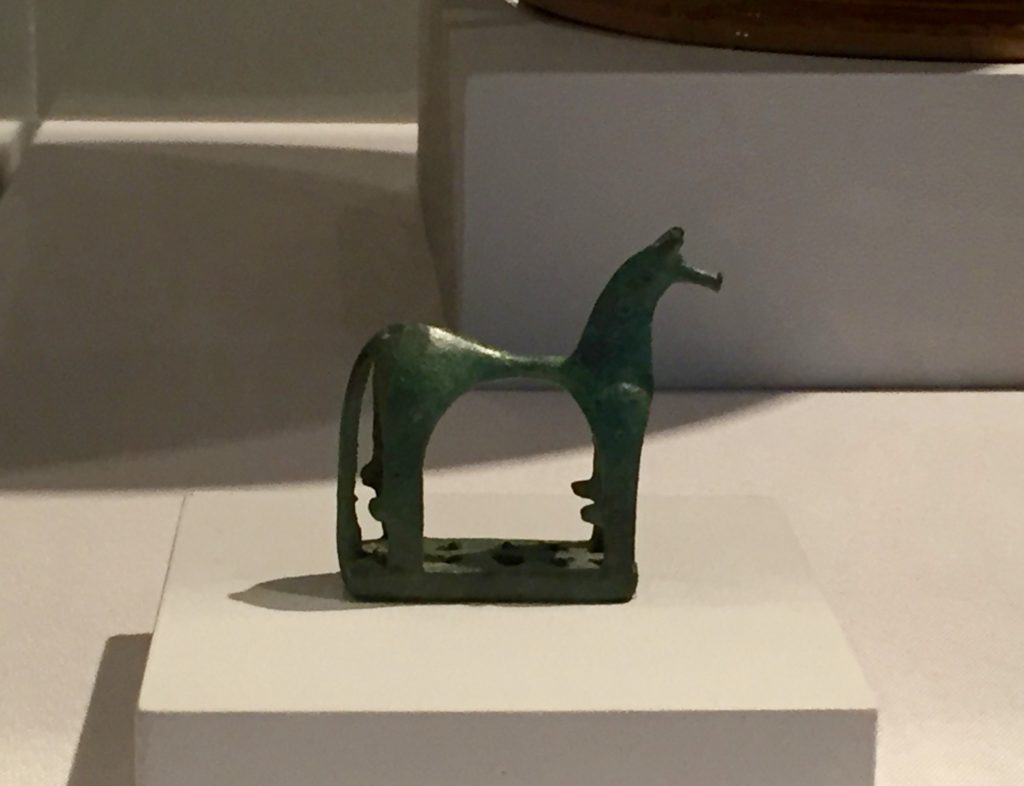
And yet. And yet. Marc himself had told Annette von Eckardt in 1914 in a response to a telegram she had sent that summer from Sarajevo describing the cataclysm set in motion that he wasn’t worried about the afterlives of his work. My new research project has taken me to Norway, to the Iron Age carvings of horses and runes on stone totems, and farther away and back, to the Aurignacian peoples who decorated the Chauvet Cave with their own towers of horses. Visiting an archaeological site in Rogaland in fall 2018, I stood with Elna Siv Kristoffersen of the Arkeologisk Museum i Stavanger looking at a small depression near the North Sea that had recently yielded a 900-year-old Viking ship. I asked how the Kristoffsersen, who studies the animal totems associated with Fifth Century Norse funerary practices, how she went about deciding where to excavate. “Oh, we don’t,” she exclaimed. “These are sacred places. They reveal themselves when they are ready. We don’t disturb the dead.” Seeing me simultaneously nodding, smiling, and, suddenly, tearful, Kristoffersen added softly. “We’ll never know what really happened in the past – not really. It is hubris to think this is possible. Some things must remain mysteries.”

After a moment she asked, “What about your painting?” I had showed Turm der blauen Pferde and told its story at a conference devoted to horses at the museum. I realized at that moment something that the new project would turn on; that I had felt, deep down, all along, a feeling confirmed by the circus at the Haus am Waldsee and Pinakotheken. “It’s gone,” I said turning to to Kristoffersen. “I hope they never find it.”


[i]“Missing: Franz Marc’s The Tower of Blue Horses,” last modified 3 March 2017, https://www.pinakothek.de/en/exhibitions/missing-franz-marc-s-tower-of-blue-horses-contemporary-artists-search-of-a-lost

[ii]Joachim Nawrocki, “Ersitzen oder Besitzen?” Die Welt, 25 May 2001.

[iii]For a complete account of the Gurlitt case, see Catherine Hickley. The Munich Art Hoard: Hitler’s Dealer and His Secret Legacy. (London: Thames & Hudson Ltd., 2016) On the role of the media in reporting on restitution and Nazi looted art: Alexandra Herfroy-Mischler. “When the ast seeps into the present: The role of press agencies in circulating new historical narratives and restructuring collective memory during and after the Holocaust transitional justice.” Journalism.  Vol 17, Issue 7 (13 July 2015), pp. 823-844

[iv]Das berühmteste Bild des Künstlers (…) schlägt uns in ihren Bann. Wir werden mit Macht an das Bild herangetrieben, schon im selben Augenblick aber zu achtungsvoller Distanz gezwungen. Wie eine Vision leuchtet dicht vor uns eine Gruppe von vier Pferden auf. Aus der Mittelachse nach rechts gerückt, füllt ihr Umriß das schmale Hochformat fast ganz aus, nur seitlich den Blick auf eine ebenso geheimnisvolle Landschaft freigebend. Der mächtige Körper des vorderen Tieres mißt nur wenig unter Lebensgröße. Das Pferd scheint aus der Tiefe nach vorn zu drängen und unmittelbar vor dem Beschauer zu verhalten, indem es den Kopf in edlem Schwung zur Seite wirft. Seine Stellung im Raum läßt sich nicht errechnen, denn der untere Bildrand überschneidet die Beine (…).” Klaus Lankheit. Franz Marc: Sein Leben und seine Kunst. (Köln: Dumont), 120. My translation.

[v]In a volume Marc had in his own library – he discusses it as early as 1899 – Plato tells us that the four Helios horses had distinct attributes and personalities. The first (the horse in the front of the painting) is characterized by immense beauty, size, and speed. Though Marc shows the sun and moon glowing within this animal, he also has an individuated, recognizable blaze painted on the team leader’s face. The second horse, named after Hera, steers the chariot; the third “dark horse” upon whom the sun nonetheless shines is called Poseidon (slower than the second); and the fourth, stiffly relegated to the back, takes her name from Hestia: “The horses are peaceful and friendly and one does nothing without the others.” Plato and John Alexander Stewart, The Myths of Plato Translated with Introductory and Other Observations, (London: Macmillan, 1905), 173.

[vi]“Deine glückseligen, blauen Pferde sind lauter wiehernde Erzengel und galoppieren alle ins Paradies hinein.” Franz Marc and Else Lasker-Schüler, Der Blaue Reiter präsentiert Eurer Hoheit sein Blaues Pferd: Karten und Briefe, (Prestel: München, 1988), 144. My translation. See also: Betty Falkenberg, Else Lasker-Schüler: A Life, (McFarland: Jefferson, N.C.: 2003), 86.

RECENTLY ON MICHELANGELOST™...

Art History at the Library

Art History at the Library

Art History at the Library

I was very happy to have the grant renewed and be invited back to the SouthShore Regional Public Library for another series of “Art History at the Library” discussions.

The library had in mind a series that was a little more intensive than “art appreciation”-cruise ship type talks. I did try out some kind of conceptual themes last time, but I also was able to implement my tech whirligigs and to do something I had wanted to do for a long time, have the audience be able to drive a lot of the content. I experimented with this just by stopping often to ask if people had questions or comments, and to my delight they did.

I try to memorise what I’m going to talk about so it’s possible to both extemporise as desired by the patrons’ concerns and also not get thrown off track.

Anyway the schedule for the fall is below. Thank you again to the Hillsborough Public Library Cooperative for supporting this project.

15 September: Special Guest Appearances: Art in Movies and on Television.” Participants are invited to think of their own favorite examples to discuss and share. This talk will examine the appearance of artworks and references to famous works of art in popular movies and television programs, including Vikings, Bojack Horseman, The Young Pope, Skyfall,  and more. We’ll also discuss films that are about artists and art. I am especially excited to be able to talk about some of the painterly images from The Young Pope, which so centre the body. I know a lot of people hated this show, but I liked how it looked, and found director Paolo Sorrentino and cinematographer Luca Bigazzi neomodernist visual world were stunning but also very ambiguous about the questions of faith and the supernatural raised by the narrative.

20 October: “The Body in the Book: Beauty and Suffering in Illuminated Manuscripts.”The session will be about the process of making illuminated manuscripts and scrolls including well-known examples such as the Book of Kells and the Grimani Breviary as well as less-familiar secular texts.

17 November: “What’s the Difference Between Arts and Crafts? Fashion, Textiles, and Design.” Rather than trying to come up with a definitive answer to this question, we will discuss how aesthetic hierarchies come to be. Which tdo we prize more, purely aesthetic innovation, of the form of utilitarian objects, and why? Participants are invited to share examples of their own works and of course their opinions!

15 December: “A Celebration of Animals in Art.” This discussion will cover artwork that recognizes the power of animal life, from the cave paintings of Chauvet and Alta to Tanja Thorjussen’s endangered Arctic wildlife and everything in between.

Franz Marc’s Blaues Pferd I (1911) in Bojack Horseman, above, and shots from The Young Pope (2016) below.

RECENTLY ON MICHELANGELOST™...

Email

1 + 14 =

Unfollow Me on Twitter

The only social media I participate in; this feed is mostly about art history and animals.

Introducing Michelangelost™

Introducing Michelangelost™

Michelangelost is the newest name for the blog I have been writing since 2006, which began as mostly about dogs and animals. It has since had several titles, including Errata and German Modernism, and expanded to include numerous topics. Even though this website is becoming more of an official enterprise, I have kept my experimental and sometimes idiotic posts in the archive. The name Michelangelost™ came to me in Berlin, where Michelangelostraße is one of the stops on the Tiergarten Buslinie 200. Because the name of the stop is so long it was (funnily to me) abbreviated as “Michelangelost” on the scrolling Haltestelle legend. A remarkable photo was taken to document this occasion. I love obscurantist plays on words plus it seems descriptive of where we are in the art world right now. I had intended the Michelangelost™ project to be devoted to art criticism in the broadest sense, extended beyond galleries and museums to organisations, scenes, and academic affiliates, but I like the word and this photo in a more general way. So you will have to stay tuned for that secondary project, which now tentatively has the name “Intersectional Criminal Tribunal.”  Meanwhile I am experimenting with this new design and how to retroactively typeset the older posts. – Until soon.

RECENTLY ON MICHELANGELOST™...

Condensation Cubes

Condensation Cubes

Possibly Etruscan horse, bronze, c. 3rd Century BCE

Possibly Etruscan horse, bronze, c. 3rd Century BCE

Over the summer I began writing for Arte Fuse with this review of Vapor and Vibration: The Art of Larry Bell and Jesús Rafael Soto at the Tampa Museum of Art. I quite like the show, and thought the curator was quite successful with this experimental pairing of two artists with no personal connection. It’s been so soothing to just sit quietly in the Animals in Ancient Art gallery at the TMA too, so I was sad to learn its last day is 1 July. The TMA also has a lovely collection of Etruscan mirrors.

While at the museum I saw for the first time some paintings of birds by Hunt Slonem. I got to observe many macaws in Miami and cockatoos, a nonnative species who have crossed the Tasman Sea to make themselves at home in New Zealand, are also very familiar. I thought the two paintings shown here used some interesting techniques to get to what’s essential about these clever and beautiful members of the parrot family. The focus on the pink tones and sociability of the cockatoos and of the strong beaks and feather structures of the macaws, absent their brilliant colors, is quite thoughtful.

Until soon. – JMC

Hunt Slonem, Cockatoos, 2004.

Hunt Slonem, Cockatoos, 2004.